4.1 Loading hyperspectral images and training data
This section describes the essential steps for beginning the preprocessing of hyperspectral image data. Ensuring that the data is correctly loaded and organised is fundamental for successful model training and testing.
The process starts by creating a new project via the “Main menu”, where a project name must be assigned (Figures 10 and 11). All subsequent actions are carried out within the “Analyzer” mode. During project creation, it is possible to either import new image files immediately (Figure 12) or open a previously saved project (Figure 13).
Once the project is named, a default folder titled “Group” is automatically created as the initial workspace. This folder can be renamed by right-clicking on it, selecting “Rename”, and entering a new name (Figures 14 and 15).
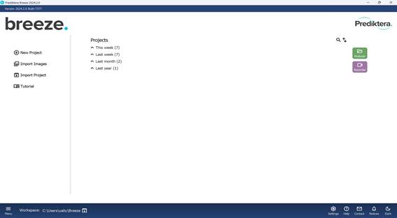
Figure 10 – Main navigation menu of the software
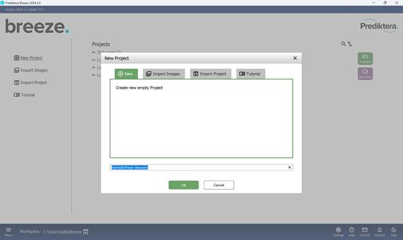
Figure 11 – Creating a new project and naming it

Figure 12 – Image import during new project creation
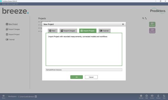
Figure 13 – Project import (from existing file)
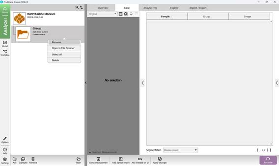
Figure 14 – Renaming a folder in the project
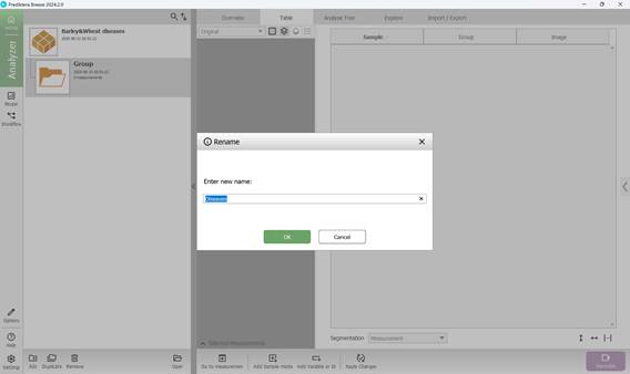
Figure 15 – Entering a new folder name in the project
The created folder includes several sections that summarise key results obtained from loading hyperspectral images: “Overview”, “Table”, “Analyse Tree”, and “Explore”. The main workflow primarily takes place within the “Analyse Tree” (Figure 16) and “Explore” (Figure 17) sections, which provide a variety of tools (detailed further below) for processing hyperspectral data.
To add hyperspectral images to the current project, import them through the “Import/Export” section (Figure 18). Once imported, images appear in the “Preview” area, where additional samples can also be introduced for further analysis (Figure 19). As demonstrated in Figure 20, multiple hyperspectral images can be previewed and target regions specified within each (Figure 21). Figure 22 depicts how the loaded data is organised, along with options to customise sample names within the hyperspectral dataset (Figures 23 and 24).
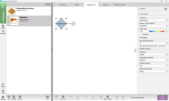
Figure 16 – “Analyse Tree” section
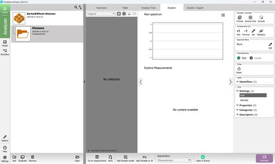
Figure 17 – “Explore” section
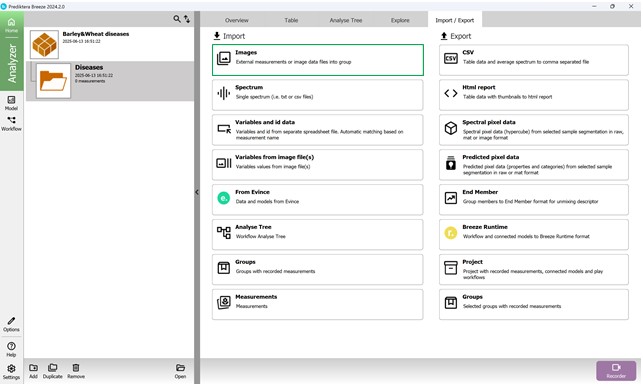
Figure 18 – “Import/Export” section: importing hyperspectral images
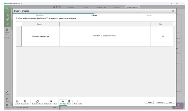
Figure 19 – Preview of imported hyperspectral image and addition of an additional sample
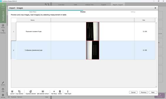
Figure 20 – Preview of multiple imported hyperspectral images
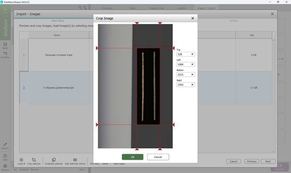
Figure 21 – Target area selection on the hyperspectral image

Figure 22 – Arrangement of uploaded data
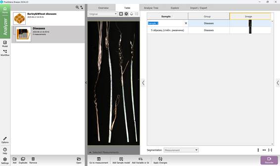
Figure 23 – Configuring sample names in the hyperspectral dataset
Preprocessing enables the generation of a Pseudo RGB image (Figure 25) along with the option to obtain the Raw spectrum (Figure 26).
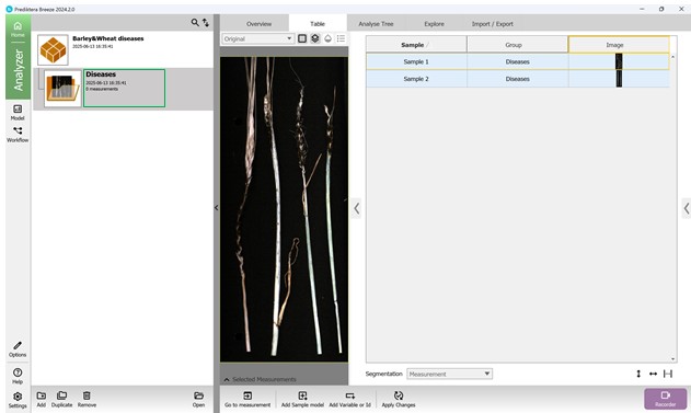
Figure 24 – Prepared hyperspectral sample set for further processing
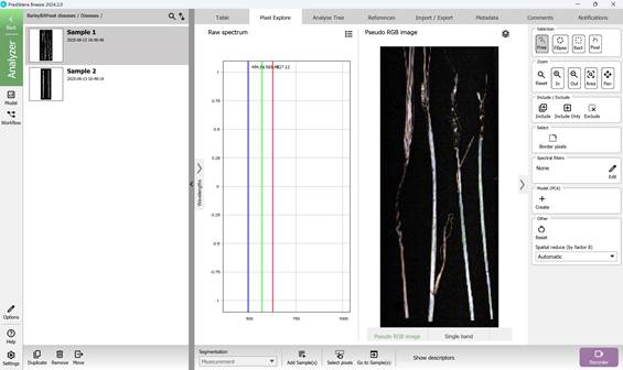
Figure 25 – Pseudo RGB image
By simply moving the mouse cursor over the image, the spectral profile corresponding to the pixel beneath the cursor can be viewed, or a complete spectral curve can be generated. Multiple regions of interest can also be selected for comparative analysis when necessary.
The right-hand panel provides tools for interacting with the imported image, including zoom controls and options to select specific regions for detailed examination. On the spectral graph, three prominent vertical lines indicate the spectral bands used in creating the Pseudo-RGB image.
To explore spectral variability, a PCA model can be generated by selecting the “Model (PCA)” feature located in the right-hand menu (Figure 26).
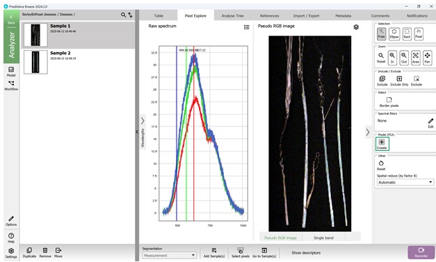
Figure 26 – Pseudo-RGB image, access to Raw Spectrum data, and building a PCA model
The PCA model is constructed using all pixel data from the hyperspectral image under analysis. In the resulting Variance Scatter plot, each point represents an individual pixel, with clusters forming based on the similarity of their spectral features. The colour gradient on the plot reflects point density - red areas indicate regions with the highest concentration of similar pixels (Figure 27).
Visualisations of maximum variance are typically displayed for principal components such as PC1 and PC2, accompanied by scatter plots where these components define the X and Y axes. By projecting hyperspectral data onto these components, it is possible to observe patterns and directions of major spectral variation (Figures 27, 28). A chart positioned above the Variance Scatter plot provides access to the raw spectral signatures of selected Regions of Interest (ROI), allowing detailed analysis of specific areas within the image (Figures 28, 29).
The software also supports alternative visualisation modes, including Pseudo-RGB composites (Figure 30) and Single-band greyscale images (Figure 31).
There is an interactive link between the scatter plot and the variance images: selecting a group of pixels in one view automatically highlights the corresponding cluster in the other, enabling intuitive exploration of the data.

Figure 27 – Maximum Variance image of the First Principal Component (PC1) and Spectral Variance distribution plot
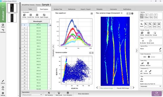
Figure 28 – Maximum Variance image of the First Principal Component (PC1), Spectral Variance distribution plot and Raw Spectra of selected Regions of Interest (ROI)

Figure 29 – Maximum Variance image of the Second Principal Component (PC2), Spectral Variance distribution plot and Raw Spectra of selected Regions of Interest (ROI)
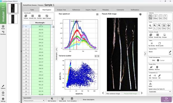
Figure 30 – Pseudo RGB image, Spectral Variance distribution plot and Raw Spectra of selected Regions of Interest (ROI)
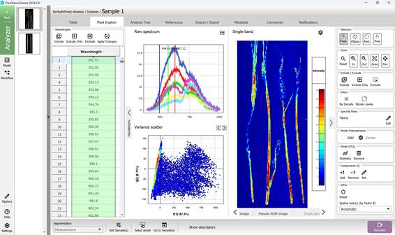
Figure 31 – Single band image, Spectral Variance distribution plot and Raw Spectra of selected Regions of Interest (ROI)